A chart is read before it is studied. In the first fraction of a second, before any number is consciously checked, the eye has already grouped some marks together, pushed others into the background, and formed a judgment about the whole. Good fund-performance reporting has to survive that involuntary first pass as well as the analyst's later audit. The grammar that governs the first pass is Gestalt — the early-twentieth- century psychology of how a visual field organizes itself into wholes, set out by Max Wertheimer, Kurt Koffka, and Wolfgang Köhler. Every deliberate choice in the dual variwide diagram of portfolio performance is an application of it.
Here are the same six holdings, drawn twice. On the left, the defaults a spreadsheet hands you. On the right, the choices the TVPI Spectrum® makes.
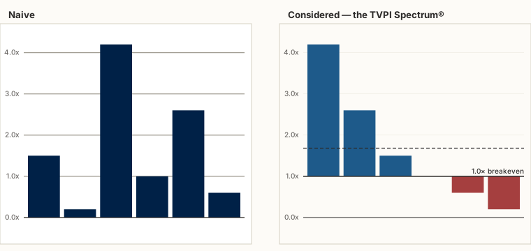
Figure and ground: the 1.0× baseline
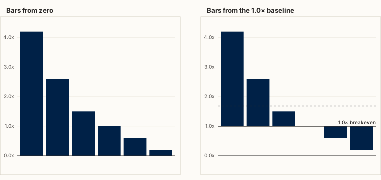
The most counter-intuitive choice is that the lower bars do not start at zero. They start at 1.0× — breakeven. Drawn from zero, every holding is just "a tall bar," and to learn whether it made or lost money you must compare each one against a threshold you are holding in your head. Drawn from the breakeven line, the question answers itself: above the line is gain, below is loss. The line becomes the ground, and each bar reads as a figure against it. The single most useful fact about a holding — did it beat breakeven? — moves from deliberate arithmetic to instant perception.
Similarity: two colors, no legend
Color is the second layer. Winners are blue; write-downs are brick-red. By the principle of similarity, marks that share an attribute are perceived as a group, so the eye assembles "the red ones" into a set without being told to — no legend, no counting. The color is redundant with the position (above or below the line), and that redundancy is the point: two cues pointing the same way make the reading robust, including for the large minority of viewers with reduced color discrimination, who still get the answer from position alone.
Proximity and common region: one column, two facts
The diagram stacks two variwides — DPI over RVPI on top, TVPI below — and each holding keeps the same horizontal position and width in both. By proximity and common region, the two facts about a holding (how its value splits into realized and unrealized, and where its total multiple lands) are bound into a single vertical column the eye treats as one object. You read a holding, not two disconnected bars that happen to share a name in a table.
Continuity: the sorted contour
Sorting the holdings from highest to lowest multiple is not housekeeping. A monotonic order gives the bar tops a smooth, descending contour the eye follows as a single line — the principle of continuity, or good form. That contour is the portfolio's shape: a steep drop from a couple of leaders, a shoulder through the middle, a tail below breakeven. In the scrambled "naive" panel above, the same numbers carry the same information and yet say nothing, because the contour has been broken.
The quiet choices
Three smaller decisions follow the same logic. The background is cream, not stark white: a lower-contrast ground lets the data sit on the page rather than glare off it, and reads as a considered report rather than a screen. The gridlines are faint, because scaffolding belongs to the ground — heavy gridlines compete with the bars for the role of figure and lose the viewer's attention to the cage instead of the contents. And the portfolio line is dashed: a dashed stroke reads as an annotation, not a data series, so it sits clearly in a third layer — a reference held against the bars without being mistaken for one of them.
None of this is ornament, and none of it is taste for its own sake. Each choice lowers the cost of the first glance, so that the fast, automatic read lands on the truth and the slower, deliberate read is freed to audit the methodology rather than decode the picture. A chart that has to be explained has already failed the first pass; a chart built on Gestalt principles is understood before it is read, and trusted because the two readings agree.
The width of each bar carries its own argument — the size of the bet — which is the subject of a companion essay on why TVPI deserves its own picture; what the resulting shape reveals as a fund matures is the subject of the power law in venture capital portfolios. You can draw your own — and see these choices working on your numbers — with the Portfolio TVPI Spectrum® Generator, free in the browser; the methodology page documents how each metric is defined.